Like it or not, the B2B buyer landscape is changing.
As the SaaS industry continues to mature rapidly, new products are flooding the market and buyers are becoming more discerning than ever. They’re researching the why and the who behind a product long before they schedule a demo.
In 2020, 68% of B2B buyers reported that their purchase cycles had increased compared to the previous year, according to Demand Gen’s B2B Buyer Behavior study. Similarly, 52% of respondents to a 2021 Korn Ferry study said that the purchase cycle has gotten longer for new vendors, indicating that this is a trend with staying power.
And it makes sense. With more options comes more pressure to make the right choice. To keep up, brands need to go the extra mile to build rapport with overwhelmed prospects.
The best way to do that? Give a human face to your B2B brand, starting with your website.
In this article, we’ll pull back the curtain on why a humanized website is crucial to building a successful brand using examples from some of our favorite B2Bs.
Table of contents
- What does it actually mean to humanize your brand?
- Four things that make a B2B website feel more human
- Humanized B2B websites: Our top 9 picks for 2023
What does it actually mean to humanize your website?
Humanizing your B2B website is simply the process of adding specific elements that give it a human look and feel.
The goal is to design an experience that makes the visitor feel that your website was built by real people for real people.
You need to show them that yours isn’t just another faceless brand. It’s a collection of individuals that values human connection. And these days, this “human touch” matters even more than you might think.
In fact, research shows buyers are using vendor sales reps less than ever before. Since 2021, vendor sales reps have dropped out of the top five most commonly used resources for buyers. This puts additional pressure on marketing teams to deliver a personal and authentic experience from early on in the buyer journey.
But before we dive into the examples, what are some of the key elements a B2B brand can use to humanize their website?
Four things that make a B2B website feel more human:
1. The right hero
If there’s one thing that makes a humanized website different from the millions of boring-to-boring B2B websites out there, it’s that it is immediately and unmistakably customer-centric. The customer (not the brand!) is the hero of the story told on the website. The best of the best B2B websites make the visitor feel like they’re undergoing a transformation of some kind as they move across the site.
2. The focus is on what’s in it for the customer
We’re 99% sure you’ve heard this before: Your customers don’t care about you, they care about what’s in it for them. Prospects want to know how your product can help solve their problems and what their life will look like once those problems are behind them.
3. Visitors can see the people behind the brand
Humans are hardwired for connection. So why not let your website visitors meet the actual human faces behind your brand? For example, you could look for ways to offer easy navigation to your about page, team page, or why us page directly from your homepage. Or, if in line with your messaging, you could even include pictures of your team members right there on your homepage to greet visitors as soon as they arrive.
4. Your copy reflects your personality
A B2B website that sounds different is a breath of fresh air for prospects with info overwhelm. Somewhat unbelievably, many B2B websites are still caught up in corporate speak, jargon, and feature-driven copy. Customers have been hit with this kind of messaging over and over. Let your website be the one that offers something different. Something worth remembering.
Humanized B2B websites: Our top 9 picks for 2023
Now that we’ve touched on the key elements of a humanized website, let’s dive into our top examples of humanized B2B websites and show you why they work (and rock! 😉):
Example #1: Shopify — a testimonial-packed website that shows vs. tells
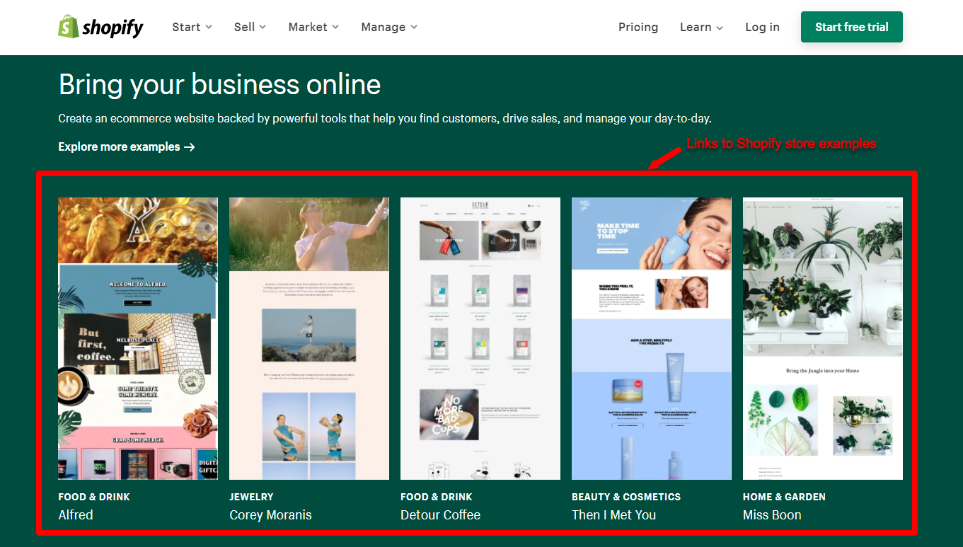
Shopify’s hero section welcomes visitors with a straightforward headline and subheading that gives the reader a good idea of who Shopify is straight from the get-go.
Right below the hero section are links to Shopify store examples that feature real-life brands across several industries, bringing the human element of Shopify’s website to life.
And it works because it shows rather than tells.
After all, what could be more convincing than curated examples of real stores that are visibly winning with Shopify?
Of course, there’s also the video testimonial front and center on Shopify’s homepage — another great way to instantly humanize the experience. And one that works for prospects at every stage of the buyer’s journey.
With the high-potency combination of human experiences and strong social proof, testimonials are a powerful persuasion tool. As Shopify has shown, they’re also a great way to show your customers you get them because, after all, you’ve handled problems just like theirs.
Example #2: Alyce — pulling in testimonials from external review sites
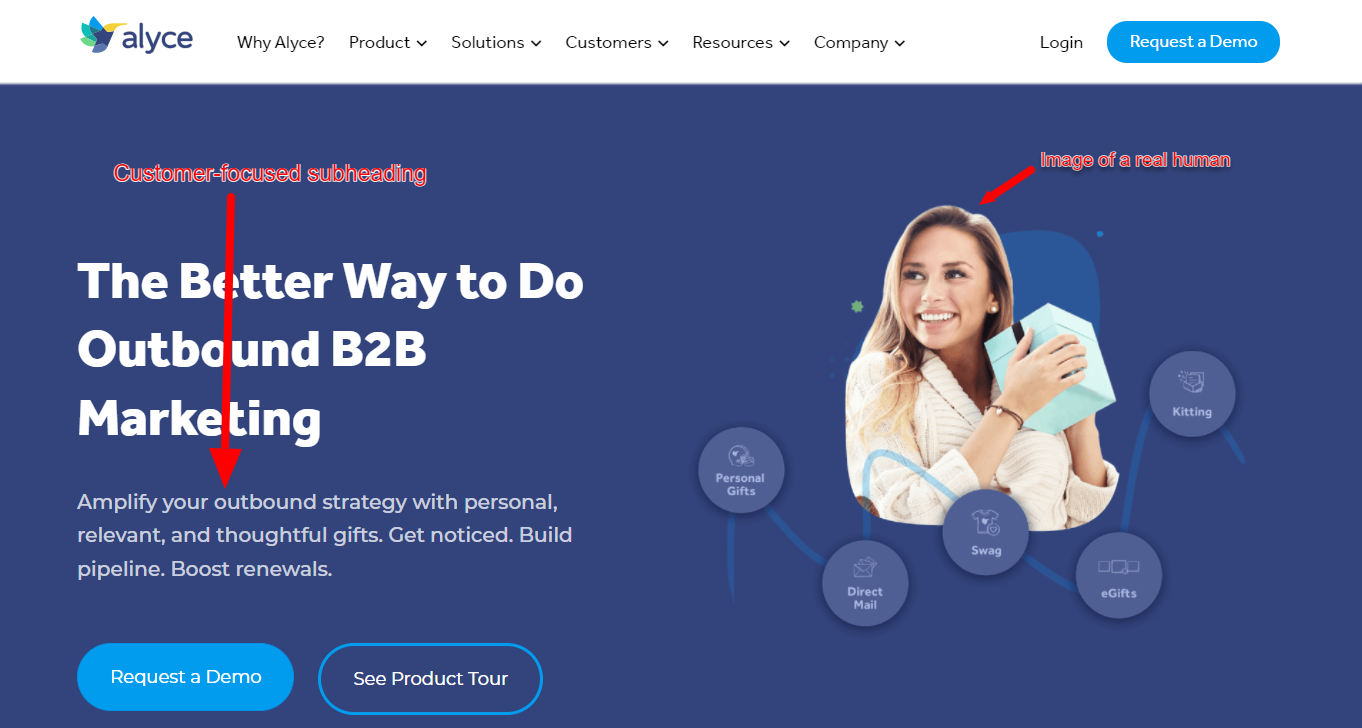
The hero section of Alyce’s homepage features an eye-catching image of a smiling woman holding a gift box surrounded by words like ‘personal gifts’, ‘swag’, and ‘egifts’.
Not only is this a clever yet subtle way to place the right keywords on your homepage, Alyce couldn’t have found a better way to connect their value prop to a real human emotion — the sheer delight that comes from receiving a great gift.
Though you could argue Alyce could have been clearer about what they do in their headline, their benefit-packed subheading more than makes up for it with a clear explanation of what they do, followed by three strong user benefits.
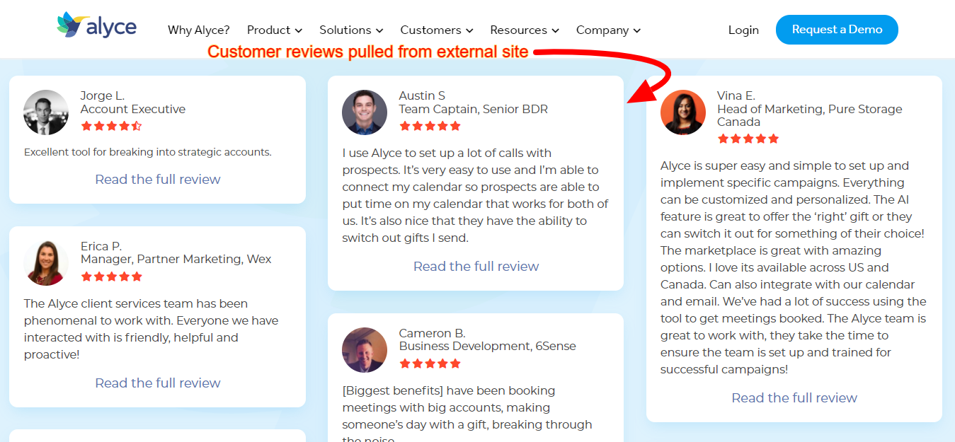
We also love that they pulled customer testimonials from an external review site straight into the home page and included links to make it easy for interested prospects to explore the reviews for themselves. To the reader, this signals that Alyce believes in their product and trusts that visitors will make an informed decision, even after viewing the objective pros and cons of their platform.
Example #3: Close — a humanized brand that speaks its target’s language
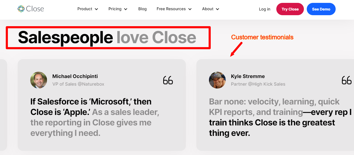
Though Close’s homepage headline, ‘The CRM built for growth’, is somewhat vague (isn’t every CRM built for growth?), the site does a great job highlighting the unique individuals that make up the brand’s target audience in the rest of the copy.
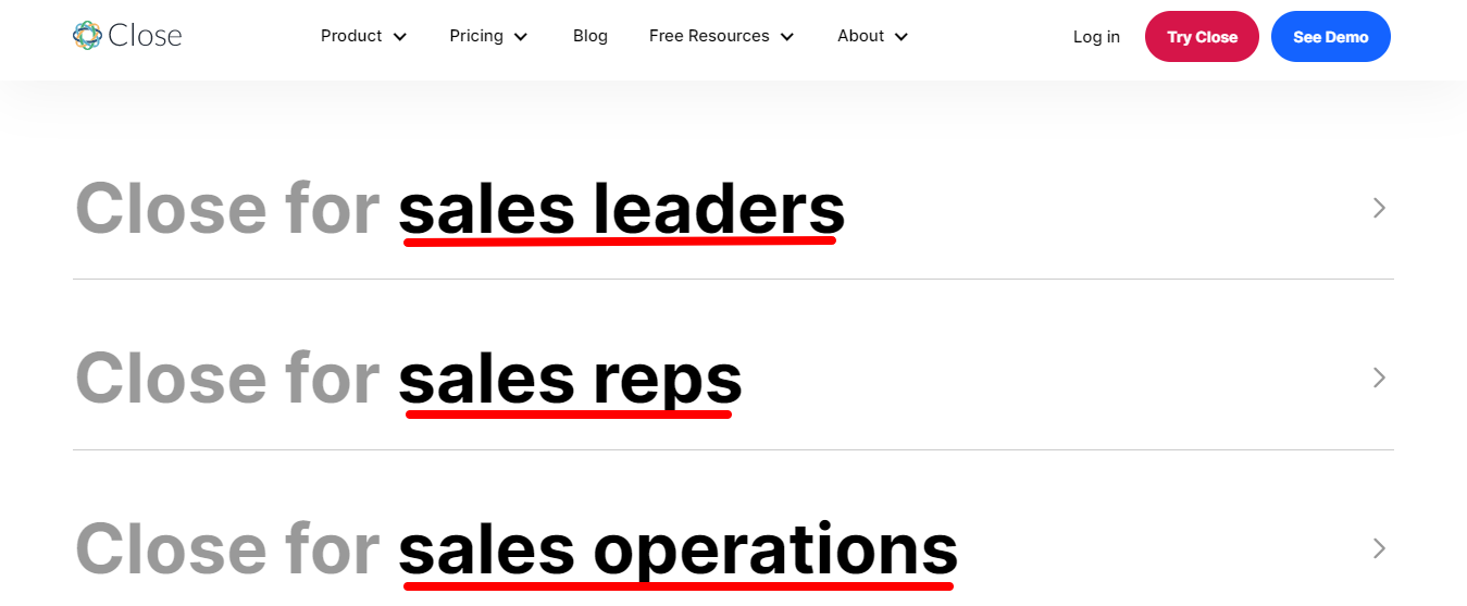
Close’s strategy of speaking to the various functions within a sales role is a brilliant way to quickly establish what feels like a one-to-one connection with website visitors who fit their ideal customer persona (ICP).
This deeply human strategy is also reflected in the testimonials they use, and the brand humanization isn’t limited to the homepage.
From Close’s about page to its product pages, the focus on salespeople resonates throughout the copy, product images, and design.
Example #4. Metadata — letting your customers do the talking
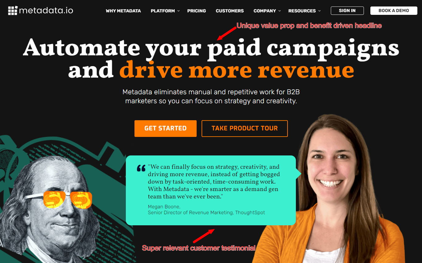
Like Close, Metadata has honed right in on their target audience.
The headline and testimonial combo used in the hero section works wonders for humanizing the brand. While the headline hits at a pain point and also offers a solution, the testimonial goes on to show how the customer’s life can be transformed by Metadata:
“We can finally focus on strategy, creativity and driving more revenue, instead of getting bogged down by task-oriented, time-consuming work. With Metadata — we’re smarter as a demand gen team than we’ve ever been”.
Notice the specific details in the testimonial. Prospects now know exactly what’s in it for them if they choose to work with Metadata. The fact that they use an image of the real person behind those words is just the icing on the cake.👌🏾
Below the hero section, there are a handful of supporting testimonials (with images of, you guessed it — real people) that serve to reinforce Metadata’s humanized messaging and shift the focus of the page from the product to the customer.
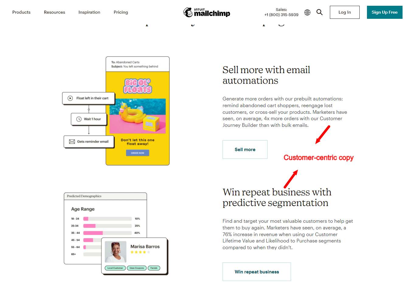
Example #5: Mailchimp — a customer-centric site from A to Z
You may remember when Mailchimp made SaaS marketing history in 2017 with their “Did you mean Mailchimp?” campaign. That campaign offers a glimpse into how Mailchimp makes their customers the hero and uses humor in their messaging across several channels.
We see the same pattern on their homepage. First, Mailchimp hits prospects with a benefit-driven headline that focuses on two key reader motivations — growing audience and revenue.
But even in the description of their product features, Mailchimp frames their copy to show what’s in it for the customer in their signature conversational tone of voice. For example, when describing their “predictive segmentation”, they say:
“Find and target your most valuable customers to help get them to buy again. Marketers have seen, on average, a 76% increase in revenue when using our Customer Lifetime Value and Likelihood to Purchase segments compared to when they didn’t.”
The first sentence gets to the heart of how predictive segmentation can help customers address a common issue (e.g., getting repeat customers). And the second sentence provides proof of this claim, getting to the reader’s very human propensity to be skeptical of marketing messages.
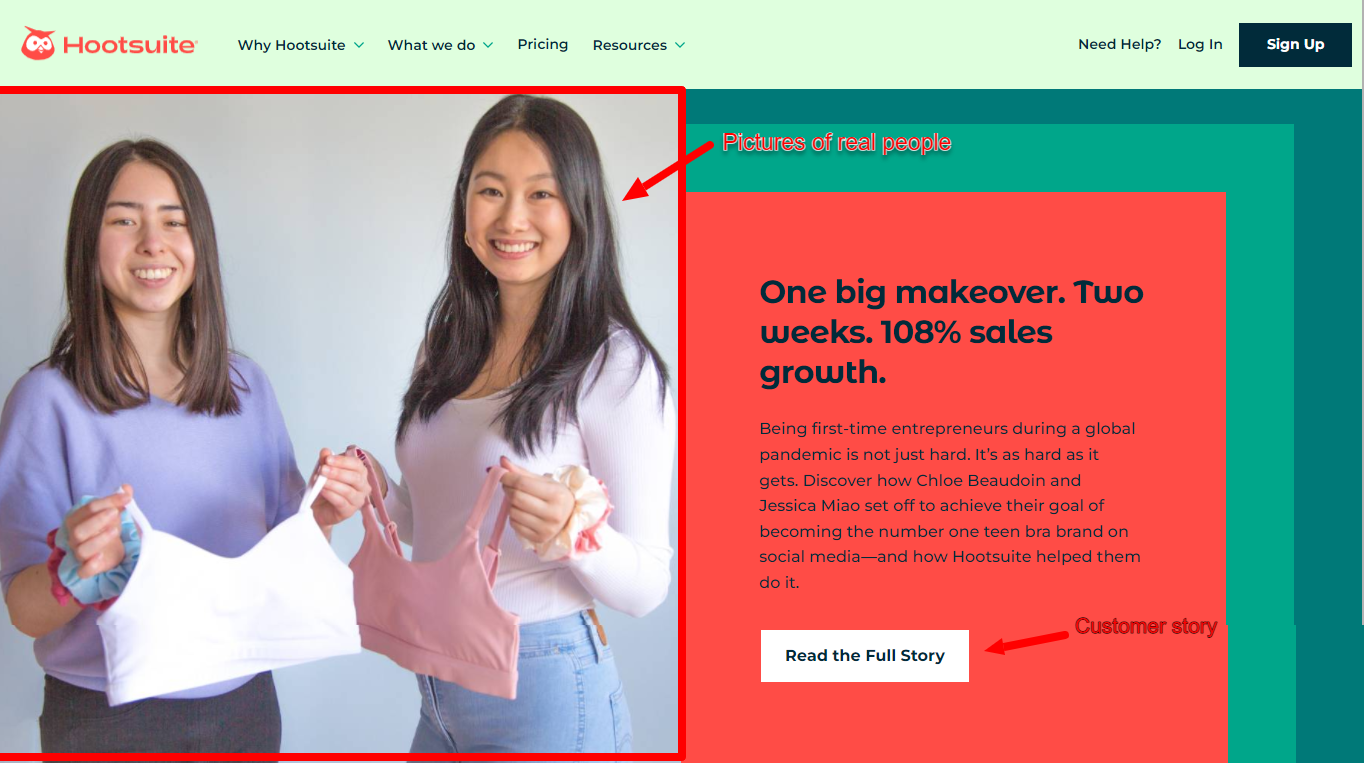
Example #6: Hootsuite — specificity in copy is important to this humanized B2B website
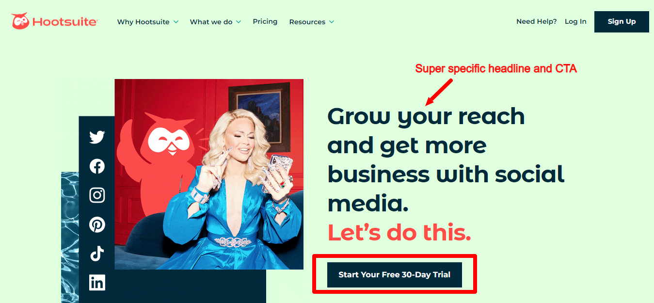
Hats off to Hootsuite for their simple, beautiful website. It truly is a joy to look at.
And it doesn’t hurt that their copy is awesome too. With a super specific headline that clearly states their value proposition and a direct CTA that prompts the reader to act now, Hootsuite proves that well-written, results-driven copy doesn’t have to be complicated.
Below the hero section, Hootsuite includes stats on social media marketing obtained from their own original research. For visitors interested in growing their social media presence, the combination of human stories and powerful data-backed outcomes definitely does the job.
Example #7: Zendesk — a B2B website that champions their customers’ customers
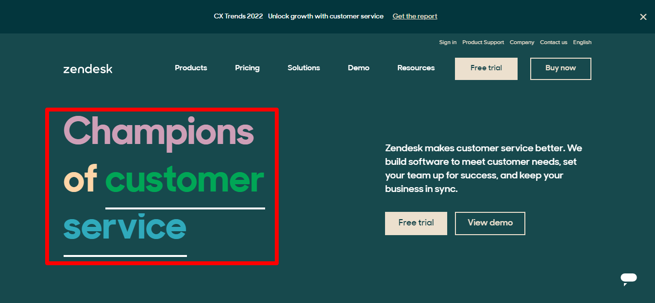
Zendesk has been creating software solutions that help users wow their customers since way back in 2007.
Their headline says it all: they truly are the ‘Champions of Customer Service’.
But the headline also achieves two important things. First, it positions Zendesk as the go-to solution for those looking for customer service software solutions. Then, it nudges their website visitors to see themselves as people — humans who, like them, care deeply about the quality of the service they offer.
Though the supporting copy is a little Zendesk-centric, they did a great job humanizing their website copy where it matters — in the hero section.
We also love that they kept the features section concise and included links for customers who want to learn more. With this type of seamless UX, navigating the homepage is much easier and much more human.
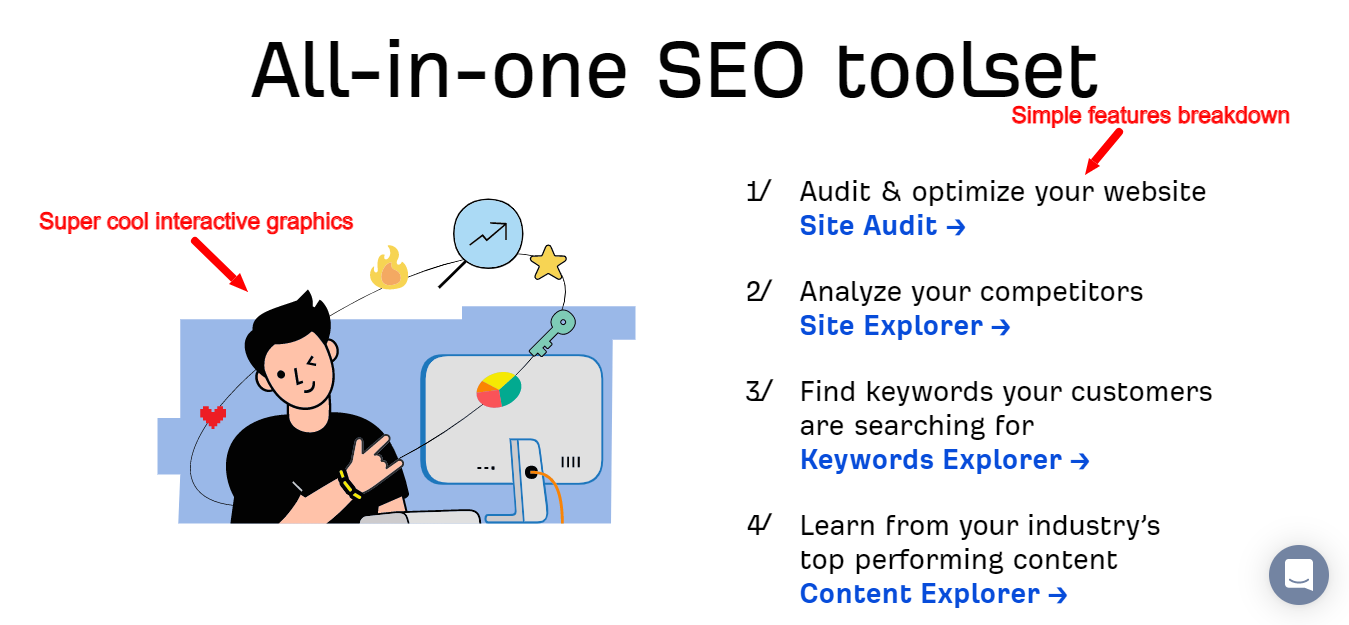
Example #8: Ahrefs — a B2B brand with a deeply human quirk-factor
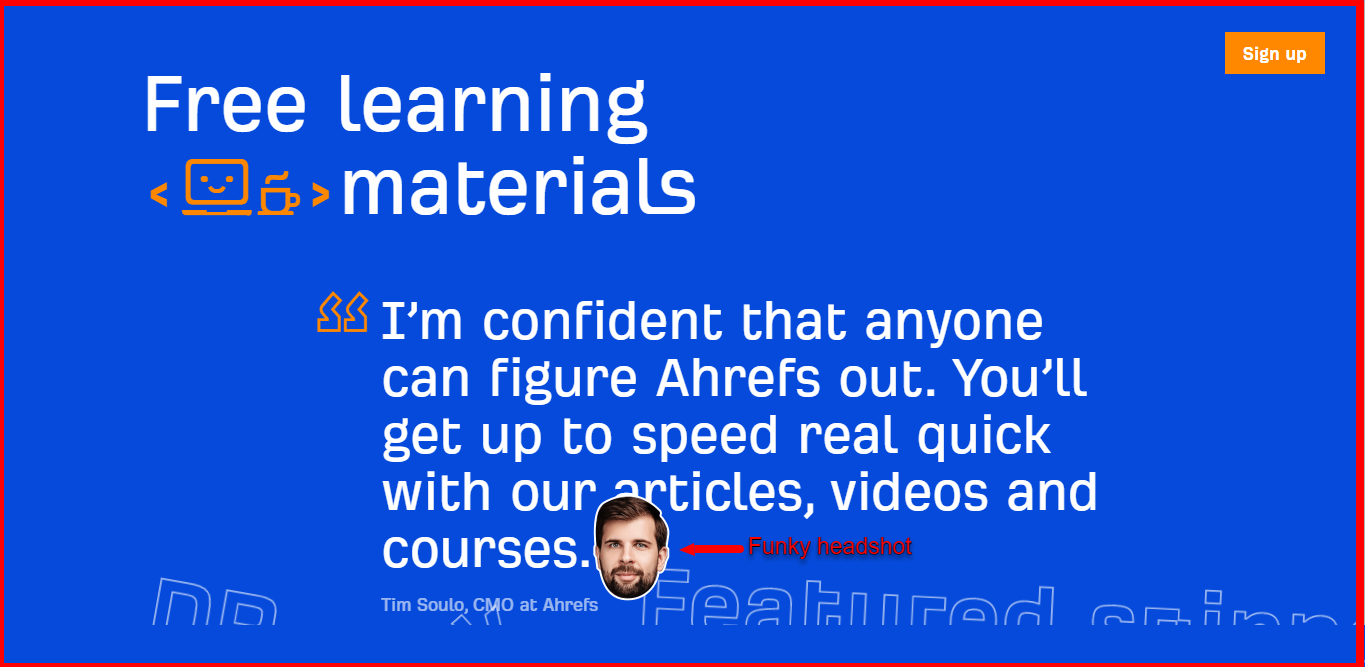
What stands out on Ahrefs’ homepage is the instantly recognizable and dare we say “quirky” tone of voice used throughout the entire site. The interactive graphics and funky headshots complement the copy’s tone and position Ahrefs as a brand with a distinct personality.
The headline is direct and reflects their core value proposition. Below the hero section, they included a list of hero features, plus a one-sentence explanation of what you can do with each one.
Example #9: GrooveHQ — all about customer happiness
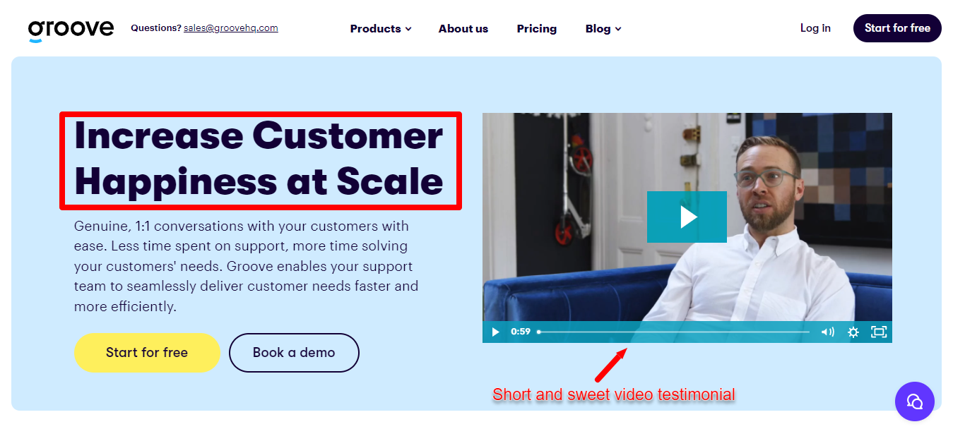
Groove’s hero section features their “increasing customer happiness” value prop and a subheading that explains exactly how they help customers achieve that. Plus, there’s a short and sweet video testimonial that tells a deeply human founder story (straight from the founder himself, of course).
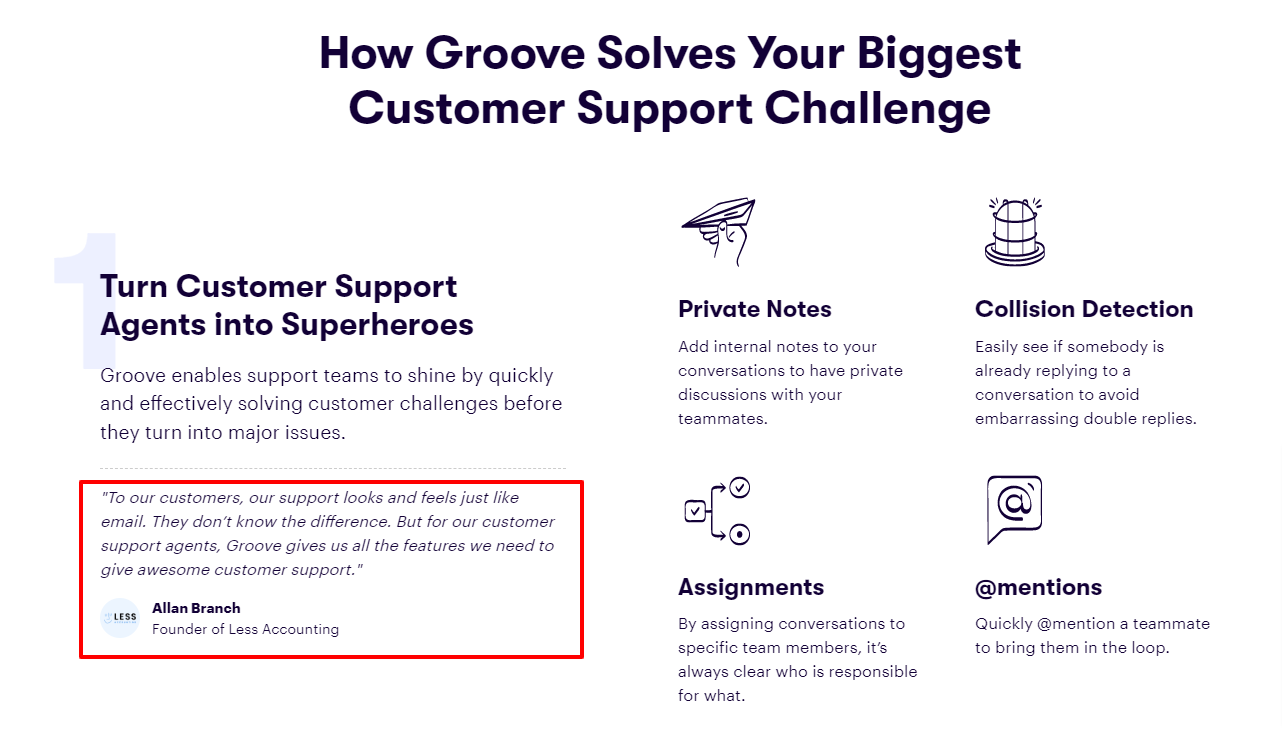
Below the hero section, there’s Groove’s own brand story — why it was built and the problems they solve for their customers:
“Our founder, Alex, had a growing small business that was being held back by poor support processes – particularly multiple team members using one shared email inbox to communicate with customers at scale. This led to Groove…”
We all know the power of story. This section drives home the point that Groove was built by real people who understand the challenges small businesses face when it comes to customer support.
Next up, is an awesome section about Groove’s features. We love that the breakdown of each feature is clear yet specific and backed up with a customer quote on exactly how that feature benefits them.
Put humans at the center of your B2B brand
If there’s one unifying theme in all of the examples, it’s that your B2B brand needs to work on building personal connections with your customers. And that starts with taking a customer-centric to your multichannel messaging, beginning — but certainly not ending — with your website.
Your customers are being bombarded with B2B marketing messages daily. To stand out in a sea of sameness, you’ll need to put not only their business interests, but their human interests first.
Mujidat is a freelance copywriter and editorial assistant for Pointed. She works with funded B2B SaaS and tech brands to map out a strategy and create content that aligns with their marketing goals and drives ROI.