Retailers in the NYC Fashion District painstakingly design the perfect window displays to pull customers in off the streets. Your digital presence works the same way. Think of your B2B website as your online storefront where potential clients window shop for solutions before reaching out to someone on your team.
And the same is true for B2B buyers.
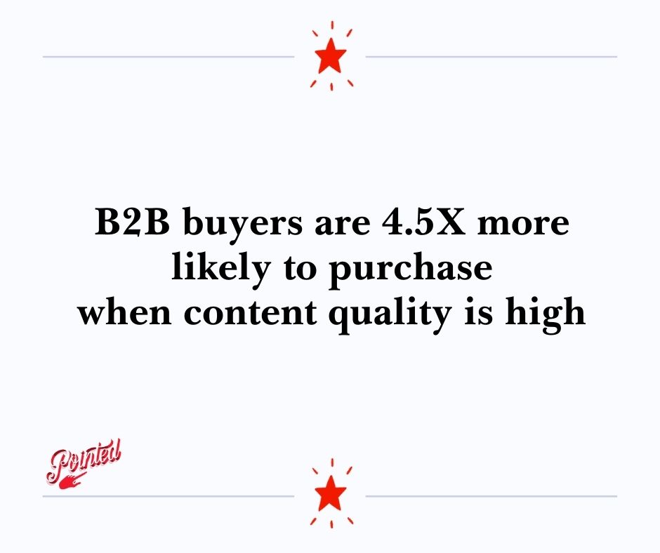
In fact, according to recent research by Gartner, B2B buyers are roughly 4.5x more likely to make the purchase if the content quality is consistently high.
Not only does a perfectly-honed website help potential customers find your company, it also encourages them to engage with your business from that first entry point all the way through to a sale and in some cases, becomes a crucial information hub that keeps them coming back for more.
But it’s got to be ace-level quality from A to Z.
So where do you start?
Whether you’re in the process of a messaging overhaul or just looking to spruce things up, we’ve got the B2B website inspo you need to make sure this next iteration places you firmly among the best of the best.
Before we deep-dive into the top B2B websites of 2020, it’s essential to know why a website is a must for your B2B business.
What Is a B2B Website? (And Why You Really Need to Nail It)
Unlike a B2C website, a B2B website is focused on educating visitors—not selling to them.
But your B2B website should do more than inform the world about your business. If you use it as an online brochure, you’ll likely divert customers away from your products or services.
Your site is often the first engagement point for potential clients and a stellar chance to make a the right impression.
Here’s a quick list of things every great B2B website should do:
Engage and educate
When someone lands on your homepage, they have one question, “what’s in it for me?” In other words, they want to know if you can fix their problem. This answer should be front and center, whether it’s an opt-in, free demo, trial membership, or free download that gives them more insight into your solutions.
Customers should also be able to see themselves in your content. Each piece of copy, blog post, or customer testimonial should take them one step closer to their buying decision by answering their questions and helping them feel like you understand their needs.
Enhance visibility
Have you ever driven past a business and gone home to look them up online? Chances are if they don’t have a website, you likely never think about that business again. Prospects are looking for fast solutions, and search engines are their go-to starting point. A website puts your business at the fingertips of decision-makers.
Offer support
In this day and age, your website doesn’t have to keep regular business hours. Just like their B2C counterparts, B2B prospects can shop for solutions around the clock. You can add capabilities like bot support for 24/7 customer service, and options to register for a sales call, webinar or free demo.
Your products or services are a significant investment for companies. Your website is a great way to set their minds at ease because you can showcase testimonials, case studies, media spotlights, and other recognitions that provide social proof.
Best B2B Websites: Our 10 Top Picks for 2020
So, what makes or breaks an effective B2B website? These sites don’t just razzle and dazzle with fancy design and graphics. They take customers on a journey with a single purpose in mind while educating them about how the company can best solve their business problems.
1. Proposify – a B2B website with super smart CTAs
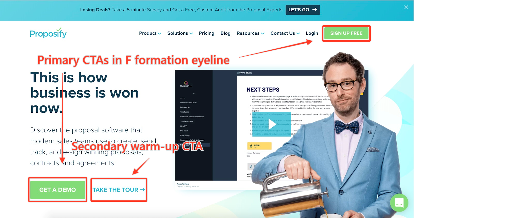
Proposify’s website cuts to the chase by offering visitors an immediate demo appointment with design and copy that compels the visitor to act.
But it’s not pushy, either. Armed with a secondary CTA, visitors who aren’t quite ready to take the plunge can take a tour of the site to learn more. The homepage also has an eye-grabbing headline and subheading that explains precisely what this SaaS can do for you.
What we like most about this example is that Proposify visitors instantly know their next steps. Plus, the professional video (not on auto-play, thank goodness) gives a great glimpse into the frustrations prospects face and how Proposify can solve them, doubling down on the pain points and encouraging lukewarm prospects to engage on a deeper level.
A quick scroll down the page, and we see a graphic that reiterates the overwhelming frustrations customers face, along with how the software provides the right solution. Overall the main pain point is obvious, and Proposify explains why they have the right tools for the job.
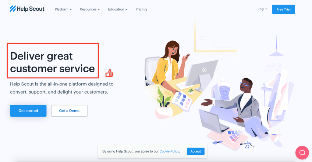
2. Help Scout – clarity is king for this B2B website
Help Scout’s been a fun one to watch.
The SaaS brand’s self-serve model was so successful, they reached roughly 4,000 customers in their first 4 years.
And they’ve done it with relatively few bells and whistles.
Any web-based copywriter knows that clarity rules supreme and Help Scout visitors immediately know what problem this B2B brand solves with a glance at the simple, 4-word headline. They also learn that this single platform offers an all-in-one solution, which eliminates a core pain point.
A quick CTA allows prospects to sign up for a free trial and dig right in. Those who need a little more nurturing can sign up for a demo session. As visitors scroll down the page, they learn what the software can do, and how it integrates with other useful tools.
Help Scout also does a great job with social proof, offering dozens of customer testimonials and sets a visitor’s mind at ease by detailing out the types of customer and educational support that come with the software.
Creative copywriting absolutely has its place in B2B websites but this is a great example of how one clear and simple promise can win your reader over.
3. Yesware – using core motivators to move web visitors to action
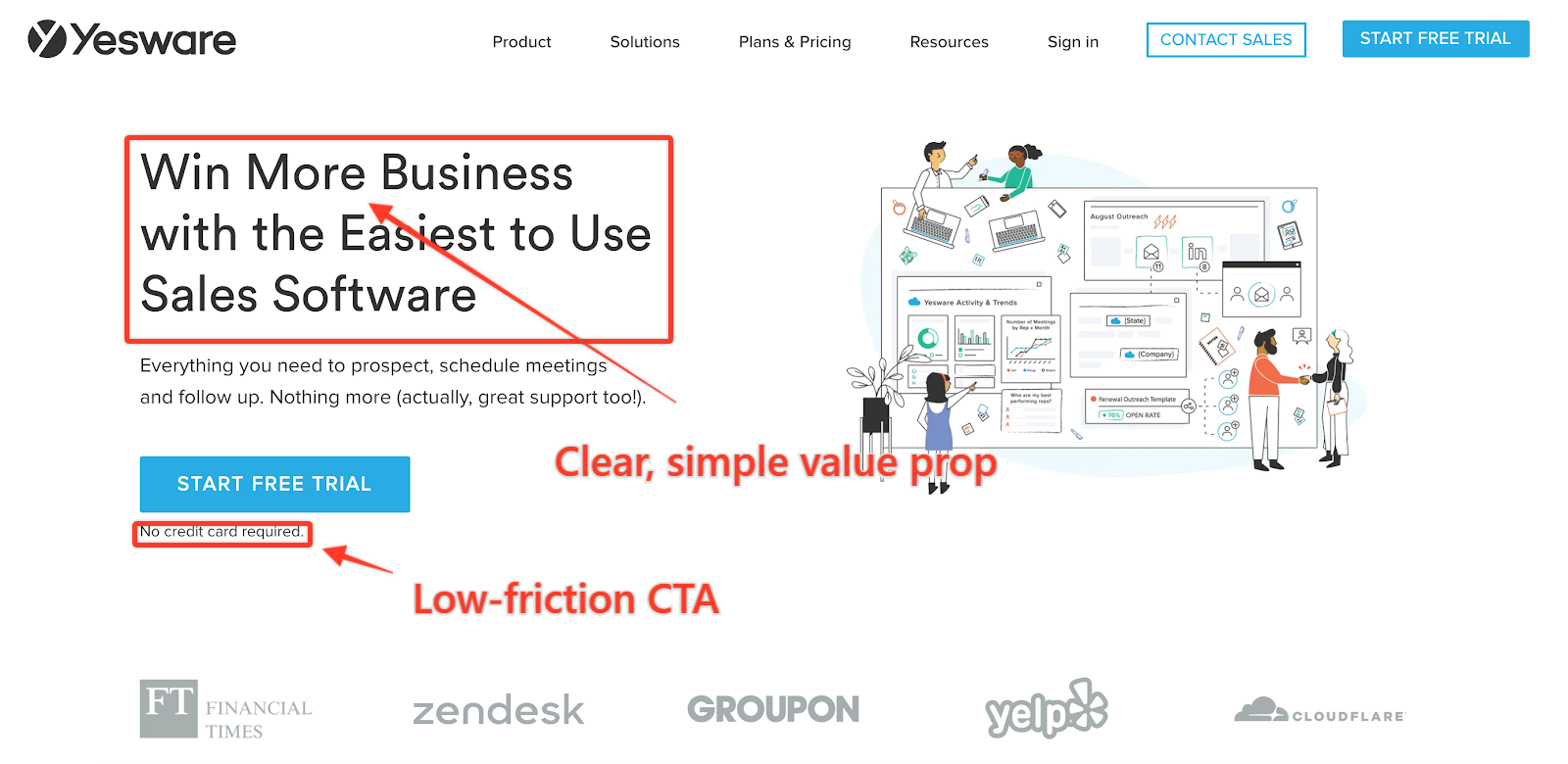
Yesware does an excellent job hitting on a key motivator: more money.
A big question on every company’s mind is, “how can this help me make more money?” and the headline nails it. The CTA is concise, inviting prospects to start a free trial while easing the fear of commitment by requiring no credit card.
Yesware focuses on the big pain point by immediately addressing ease of use and integration. You can tell they’ve done their homework and realize their clientele doesn’t want to fumble with complicated software all day.
They also do a great job showcasing social proof with testimonials and have a clean page with few graphics, so visitors stay focused throughout the experience.
4. Bench – a B2B website that keeps customers front-and-center
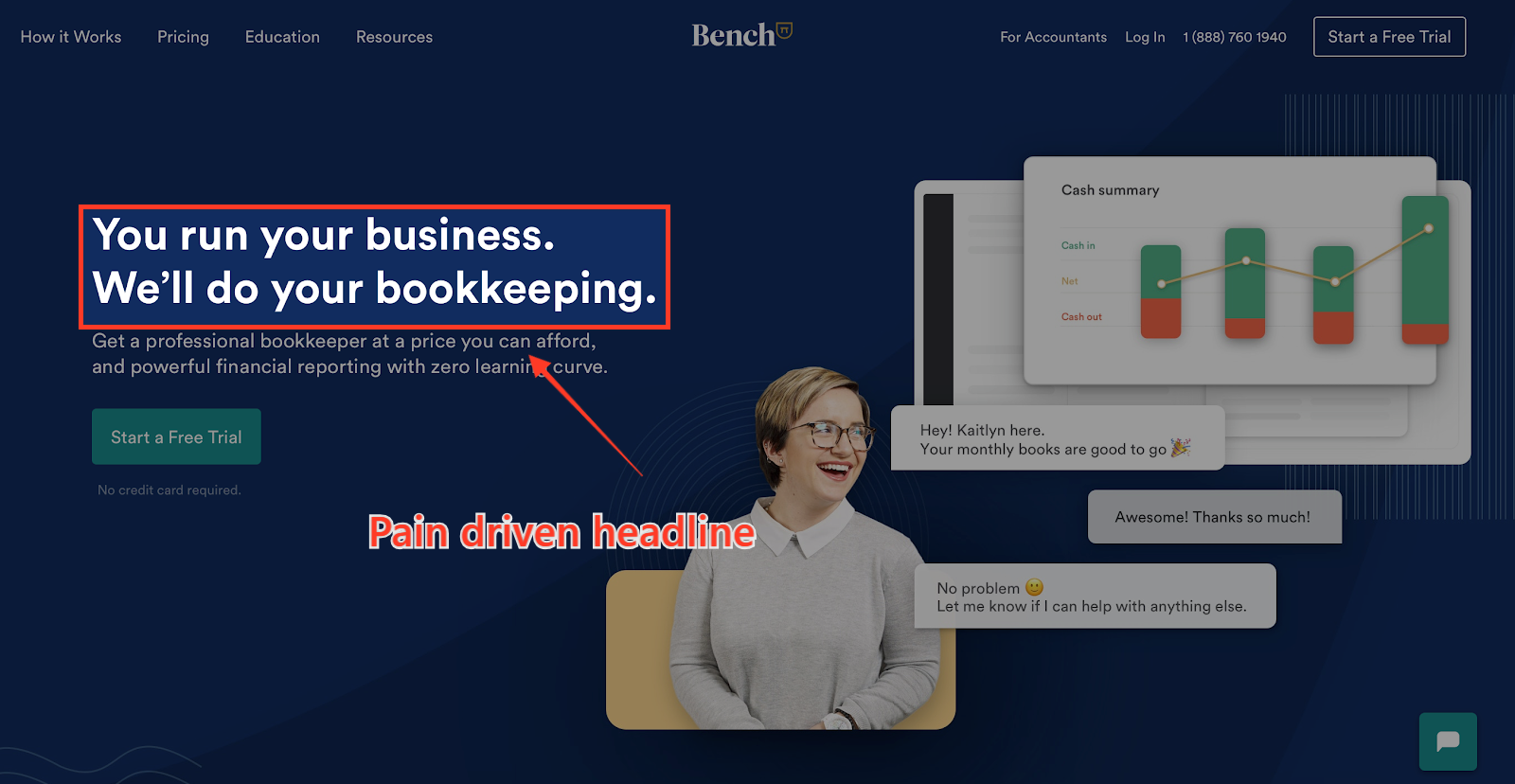
Bench gives prospects a massive sigh of relief with their headline. They understand business owners’ pain points around bookkeeping and address it front and center. Like other sites, the CTA is clear and in central focus.
Bench does a great job demonstrating the power of their customer service by displaying an interaction between a client and their service department. It’s a smart, story-driven way to show customer care is at the forefront without actually saying it.
Scrolling down the page, Bench dives right into social proof before giving details on how the products support its customers. This shows Bench is a very customer-centric business, and their primary focus is customer relations.
5. Intercom – a beautifully brand-aligned B2B website
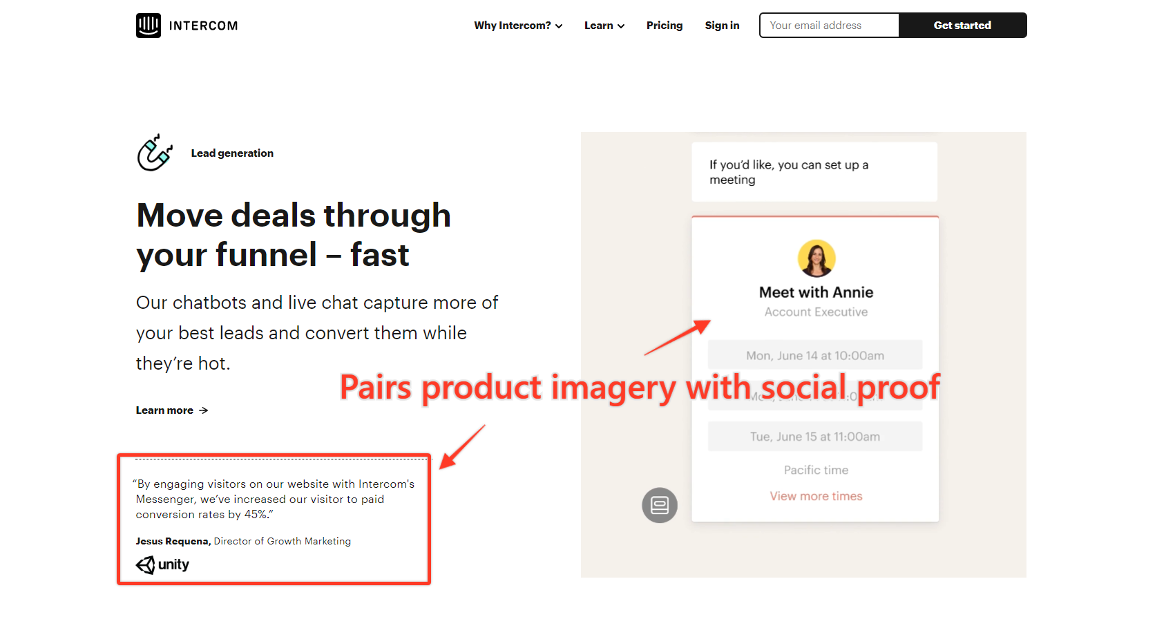
Intercom’s clean design perfectly mirrors its core function as a simple, powerful platform brands of all kinds have come to rely on.
It highlights a concise CTA below a customer-centric headline and subheading. The graphics further down the page show customers exactly what their experience looks like with the product, emphasizing the ease of use, and beautiful design.
The rest of the page is clean, highlighting social proof and the big problem-solving benefits of the product. Intercom cleverly displays the product in use next to each benefit, demonstrating how the product works for that specific purpose. It’s like a mini-demo, right on the home page.
6. Curated – specificity in headline and CTA copy for the win
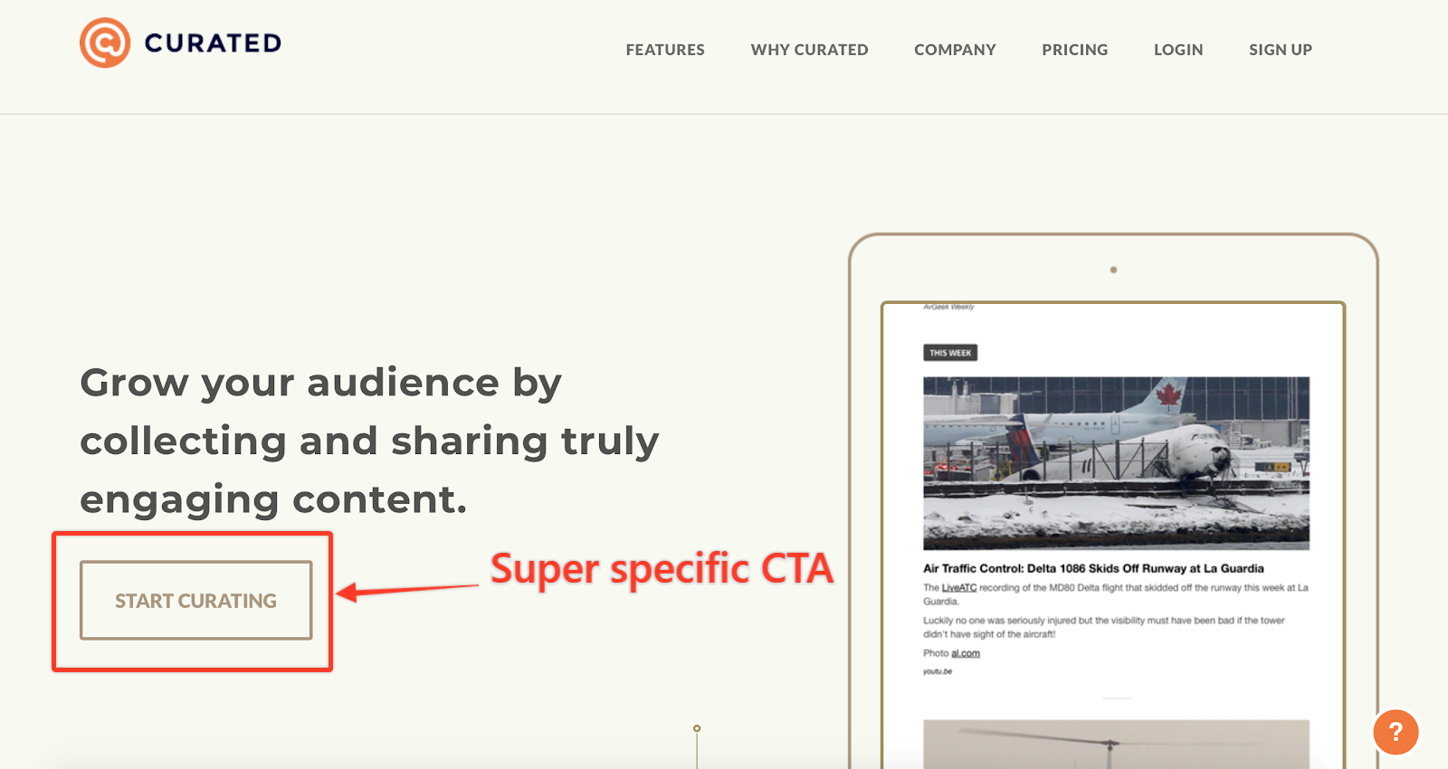
Curated takes a unique approach, ditching the subheading for a longer headline. The scrolling hero image shows the audience what the product does for their website, rather than having an explainer video.
The CTA invites prospects to start curating, which is unique to their brand. Scrolling down the page, Curated hits the big pain points and talks about the advantages their product offers to overcome them.
Their simplistic design doesn’t overwhelm the audience with graphics, keeping focused on the copy and the super-specific CTA.
7. Sherlock – winning over readers with an awesomely apt analogy
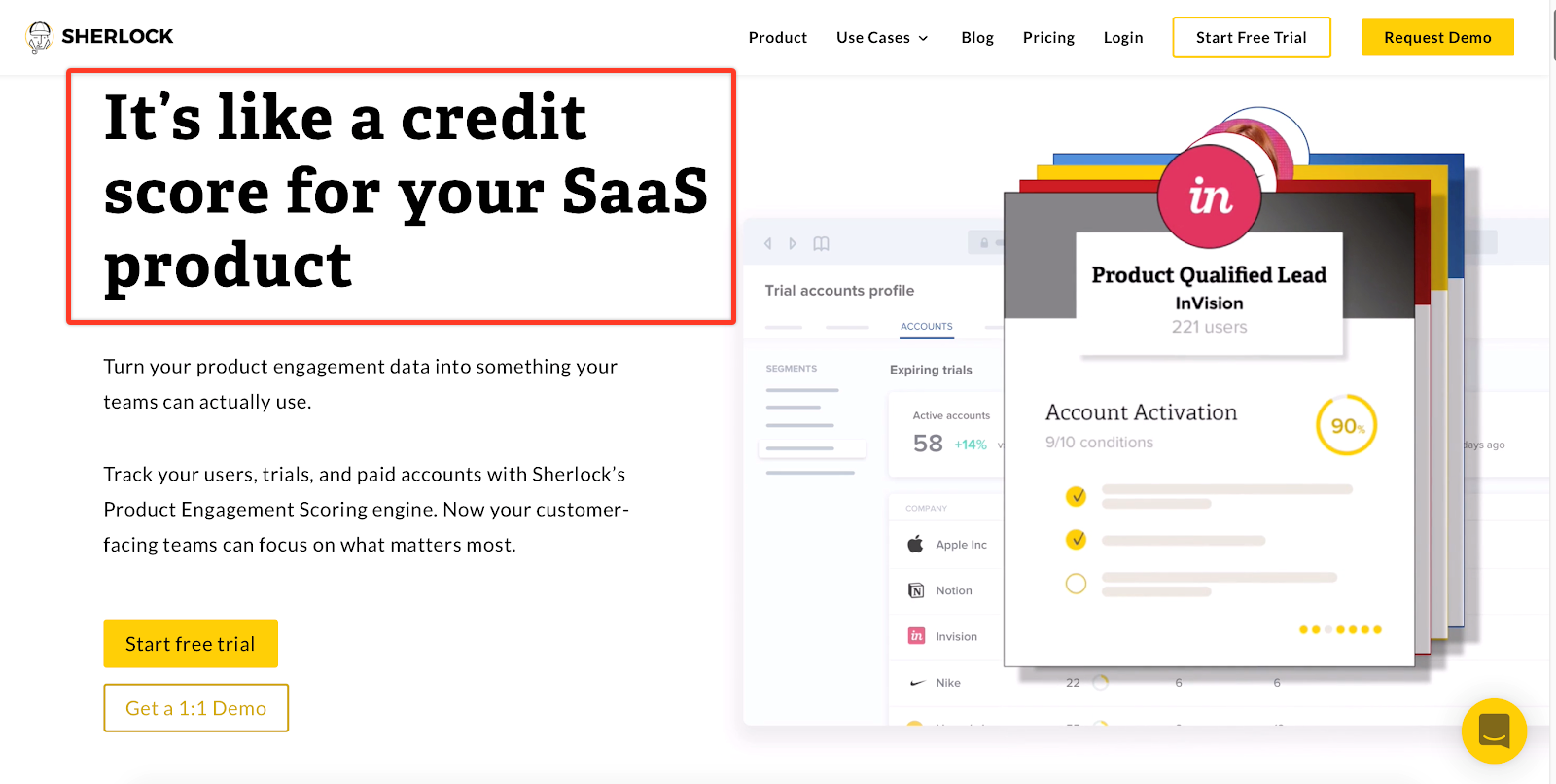
Sherlock brilliantly describes what their product does by comparing it to something familiar. This type of headline works perfectly for a product or service that may be a bit hard to explain.
Unlike the other B2B websites listed, Sherlock gives a longer description of what the product does above the fold. Additionally, the graphic changes to showcase different aspects of the product so you can see how it works in real-time.
Sherlock’s site is very graphic-focused, using images to exhibit all the nifty features, with bits of tight, succinct copy built-in. They also use big, bold testimonials with client images that stand out.
8. Survey Monkey – the right way to use Voice of Customer data in your B2B website
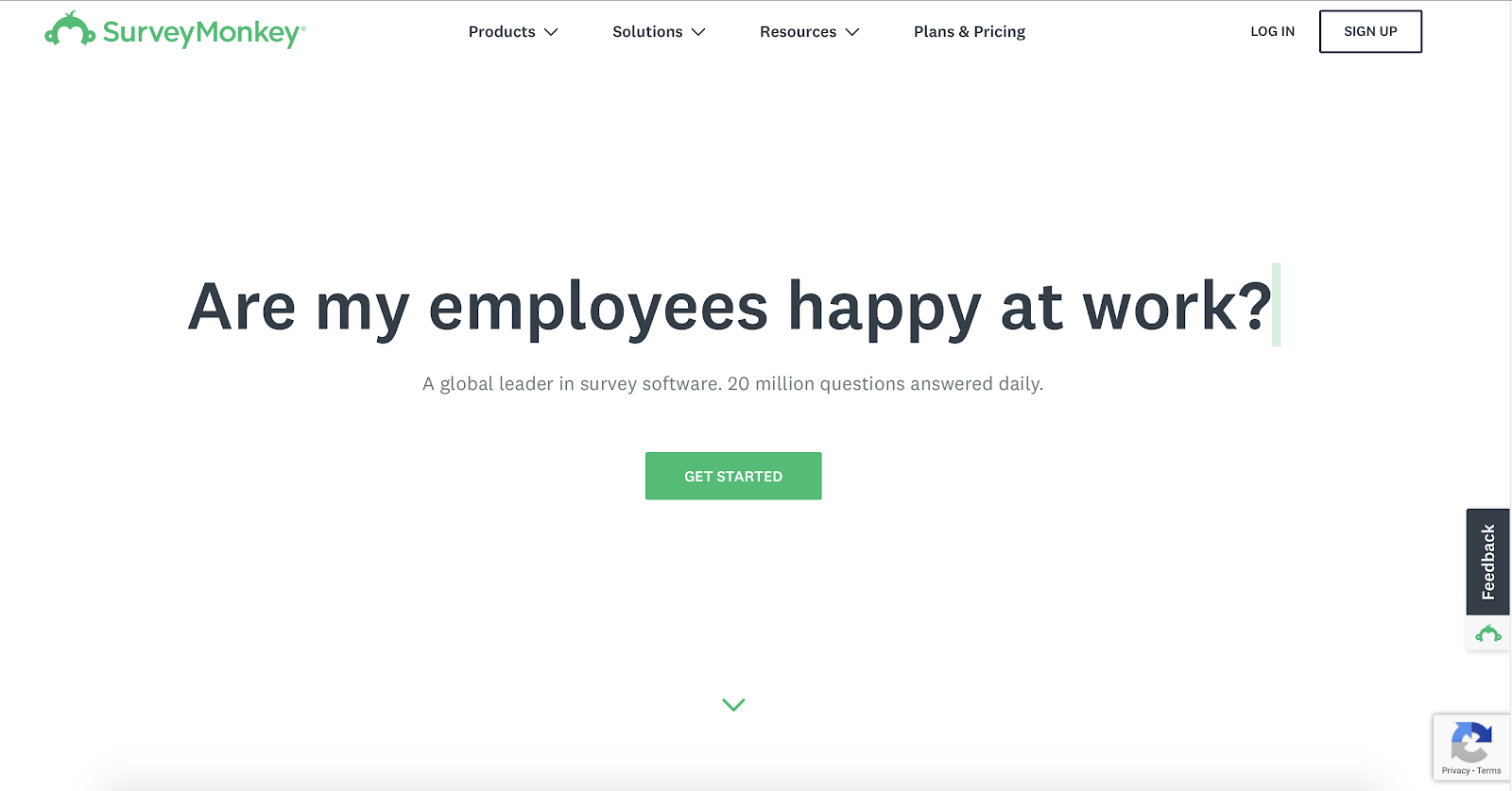
Survey Monkey shows off their product by using the headline graphic to display actual questions customers ask in surveys. The header mimics what Survey Monkey’s product looks like, which is a brilliant way to show the user what to expect.
The above the fold is short and sweet, emphasizing the CTA without a lot of copy surrounding it. Scroll down the page to reveal their product is more dynamic than a basic survey collector.
Other pages go further in-depth about their dynamic features, and they do a great job keeping the focus on starting that first survey to see what it’s all about. From there, visitors can pop over to the resource center to grab free templates, whitepapers, and other helpful (and free!) take-home content.
9. Hotjar – two simple descriptors to say it all
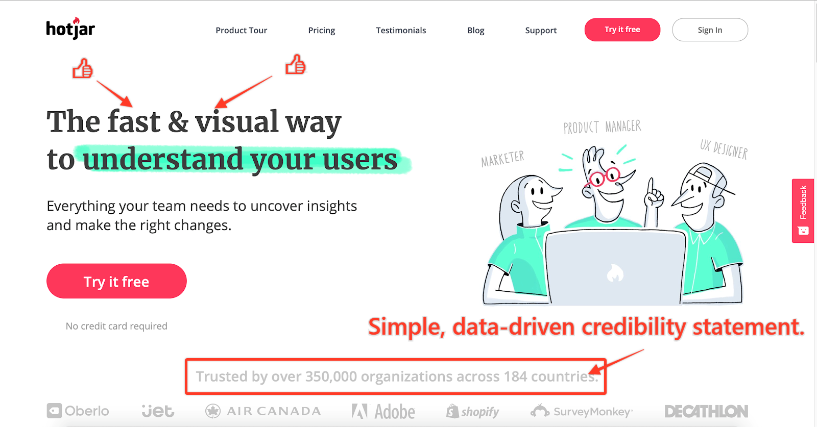
Hotjar’s visually striking header not only highlights the main benefits of their product but also illuminates who the product is for with a simple graphic.
Like other sites, their CTA offers a free trial with no required credit, something that keeps skepticism at bay. Additionally, social proof sneaks in above the fold, driving curiosity to scroll down the page.
Below the fold, Hot Jar features different interactions users have with the product, display its powerful tools, and how these tools solve the problem.
10. Square – breathing new life into played-out wordplay
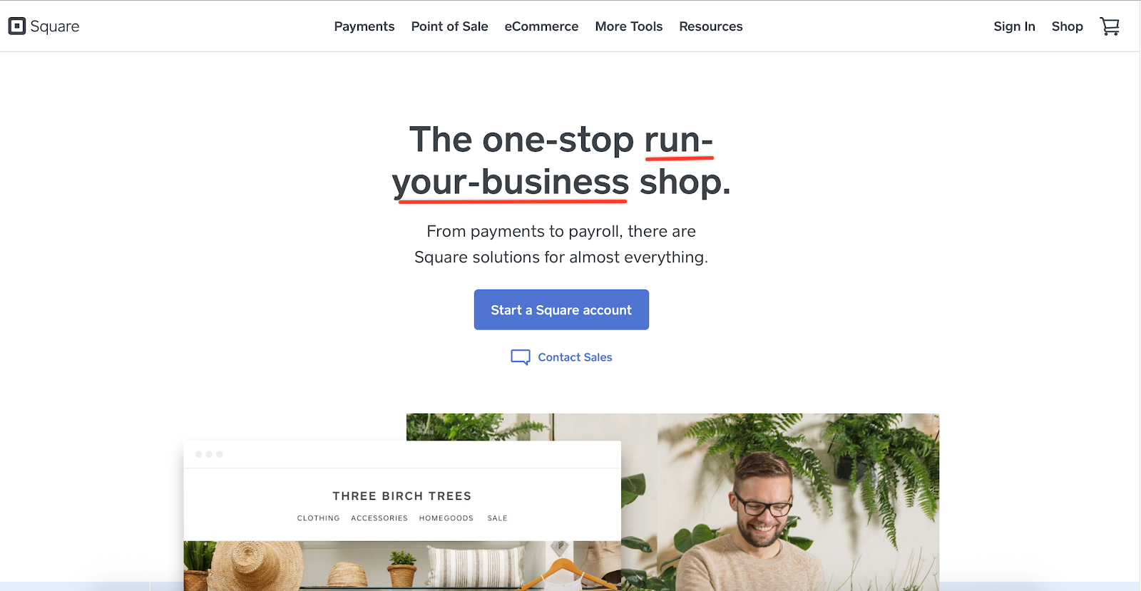
When thinking about your web copy, the words “one-stop shop” will inevitably run through your head. But Square shows us, there’s no reason to rest on B2B copywriting clichés.
The website gets to the point, with a problem-solution header and specific, single-focus CTA. The stark design keeps the prospect focused on the best benefits while avoiding confusing distractions.
Moving down the page, Square touches on key benefits while noting that it’s not just a single solution. They let retailers know they have tools and services that not only work for brick and mortar stores but also converge with online stores so they can have a more substantial presence.
Square also lets prospects know who the product is best for and what different solutions it offers based on the business type.
B2B Websites: What Do These Awesome Examples Teach Us?
These are quick glimpses into the power your online presence can have with a B2B website.
This short stack is only a fraction of the options your company has when structuring a website. However, it showcases how to build a customer-focused platform that drives users to take action.
The design and copy elements on each of these sites demonstrate the power of words, simplicity, and how they tie together to let the audience know you speak their language and have the goods that will help their company run smoother.